| 1 | # Netdata Charts |
| 2 | |
| 3 | Netdata charts provide **real-time, per-second metrics** to help you troubleshoot and explore your infrastructure with high-resolution insights. |
| 4 | |
| 5 | ## What Makes Netdata Charts Special |
| 6 | |
| 7 | Netdata excels at collecting, storing, and presenting metrics in ready-to-use dashboards. Its enhanced charts update every second and offer: |
| 8 | |
| 9 | - High-resolution, granular metrics |
| 10 | - Interactive data exploration through metric hover overlays |
| 11 | - Customizable filtering using the Definition bar |
| 12 | - Anomaly detection via the Anomaly Rate ribbon |
| 13 | - Intuitive tools for panning, zooming, and highlighting areas of interest |
| 14 | - Quick access to **Metric Correlations** for finding patterns across metrics |
| 15 | - Flexible dimension sorting by name, value, or anomaly rate |
| 16 | - Detailed chart information including plugin, context, and type |
| 17 | - Real-time status of metric collection |
| 18 | - Access to the underlying data via the **Data Queries API** for advanced use cases |
| 19 | |
| 20 | You can view these charts in Netdata Cloud’s **Metrics tab**, **individual node views**, and **Custom Dashboards**. |
| 21 | |
| 22 | ## Metric Correlations |
| 23 | |
| 24 | Netdata charts allow you to quickly identify related metrics using the Metric Correlations feature. When you highlight an area of interest on a chart (such as a spike or anomaly), Netdata suggests other metrics that display similar behavior during the same timeframe. |
| 25 | |
| 26 | This helps you find root causes or related system activity without manually searching through all metrics. |
| 27 | |
| 28 | :::note |
| 29 | |
| 30 | Learn more: [Metric Correlations documentation](/docs/metric-correlations.md) |
| 31 | |
| 32 | ::: |
| 33 | |
| 34 | ## Chart Anatomy |
| 35 | |
| 36 | Each Netdata chart is designed to provide quick insights and interactive exploration: |
| 37 | |
| 38 | 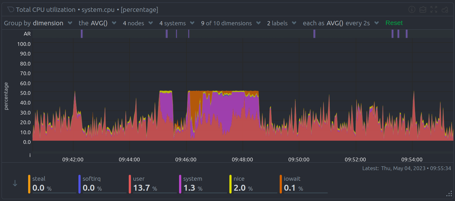 |
| 39 | |
| 40 | | Chart Element | Description | |
| 41 | |------------------------|------------------------------------------------| |
| 42 | | Title bar | Shows the chart title and units of measurement | |
| 43 | | Anomaly Rate ribbon | Displays the combined anomaly rate of all data | |
| 44 | | Definition bar | Provides filtering and grouping options | |
| 45 | | Toolbar | Offers tools for interacting with the chart | |
| 46 | | Chart area | Displays the metrics data | |
| 47 | | Legend with dimensions | Lists all metric dimensions with color coding | |
| 48 | |
| 49 | ## Core Concepts |
| 50 | |
| 51 | Understanding how Netdata organizes and presents metrics helps you make the most of its charts. |
| 52 | |
| 53 | ### Dimensions |
| 54 | |
| 55 | A **dimension** is a value shown on a chart. Dimensions can represent: |
| 56 | |
| 57 | - Raw collected data |
| 58 | - Calculated values (such as average, minimum, or maximum) |
| 59 | - Various units (such as percentages, MiB/s, GiB) |
| 60 | |
| 61 | Each chart’s legend lists its dimensions. You can hide or show specific dimensions to focus on what matters most. |
| 62 | |
| 63 | ### Contexts |
| 64 | |
| 65 | A **context** groups charts by metric type and displayed dimensions. Contexts define how charts are organized and where they appear in the Netdata menu. |
| 66 | |
| 67 | **Examples:** |
| 68 | |
| 69 | - `apps.cpu` for **Apps CPU Time** |
| 70 | - `apps.mem` for **Apps Real Memory** |
| 71 | |
| 72 | The part before the dot (`.`) is the **type**, while the part after is defined by the chart’s developer or its family. |
| 73 | |
| 74 | Contexts are also used for alert configurations. |
| 75 | |
| 76 | ### Families |
| 77 | |
| 78 | A **family** represents a specific instance of a hardware or software resource that needs its own chart. |
| 79 | |
| 80 | For example, in disk monitoring: |
| 81 | |
| 82 | - Disk drives like `sda` and `sdb` each have their own family. |
| 83 | |
| 84 | The combination of **context** and **family** forms the `[context].[family]` naming scheme: |
| 85 | |
| 86 | | Context | `sda` family | `sdb` family | |
| 87 | |----------------|--------------------|--------------------| |
| 88 | | `disk.io` | `disk_io.sda` | `disk_io.sdb` | |
| 89 | | `disk.ops` | `disk_ops.sda` | `disk_ops.sdb` | |
| 90 | | `disk.backlog` | `disk_backlog.sda` | `disk_backlog.sdb` | |
| 91 | | `disk.util` | `disk_util.sda` | `disk_util.sdb` | |
| 92 | |
| 93 | ## Title Bar |
| 94 | |
| 95 | The Title bar provides essential information and quick actions for each chart: |
| 96 | |
| 97 |  |
| 98 | |
| 99 | | Title Bar Element | Description | |
| 100 | |-------------------|-----------------------------------------------------| |
| 101 | | Netdata icon | Indicates live data updates (when time is playing) | |
| 102 | | Chart title | Shows the title, metric, and unit of measurement | |
| 103 | | Chart status icon | Displays loading, timeout, error, or no-data status | |
| 104 | |
| 105 | Quick actions available from the Title bar: |
| 106 | |
| 107 |  |
| 108 | |
| 109 | | Action | Description | |
| 110 | |------------------|--------------------------------------------------------------| |
| 111 | | Manage Alerts | Configure alerts for this chart | |
| 112 | | Chart info | View detailed chart metadata | |
| 113 | | Chart type | Switch between line, stacked, area, bar, and multi-bar views | |
| 114 | | Enter fullscreen | Expand the chart for full-screen analysis | |
| 115 | | User settings | Save chart preferences across dashboard reloads | |
| 116 | | Drag and Drop | Add the chart to an existing or new dashboard | |
| 117 | |
| 118 | ## User Settings Priority |
| 119 | |
| 120 | When configuring chart preferences using the User Settings action in the Title Bar, Netdata applies the following priority order: |
| 121 | |
| 122 | Personal settings: Highest priority, specific to the individual user. |
| 123 | |
| 124 | Room settings: Shared across users in the same Room if no personal settings exist. |
| 125 | |
| 126 | Space settings: Global defaults across the Space if no Room or personal settings exist. |
| 127 | |
| 128 | This hierarchy ensures that your personal preferences always take precedence, while still allowing collaborative defaults at the Room or Space level. |
| 129 | |
| 130 | ## Definition Bar |
| 131 | |
| 132 | The Definition bar provides powerful filtering and grouping options, helping you explore your metrics more effectively: |
| 133 | |
| 134 |  |
| 135 | |
| 136 | | Definition Bar Element | Description | |
| 137 | |------------------------|----------------------------------------------------| |
| 138 | | Group by option | Choose how to group your data visualization | |
| 139 | | Aggregate function | Select how to aggregate data from multiple sources | |
| 140 | | Nodes filter | Filter data from specific nodes | |
| 141 | | Instances filter | Filter specific instances of data | |
| 142 | | Dimensions filter | Filter particular dimensions | |
| 143 | | Labels filter | Filter by specific labels | |
| 144 | | Time aggregation | Control how data points are aggregated over time | |
| 145 | | Reset button | Return to default filtering and grouping settings | |
| 146 | |
| 147 | ## NIDL Framework |
| 148 | |
| 149 | The **NIDL (Nodes, Instances, Dimensions, Labels)** framework helps you filter, group, and understand chart data at a glance. |
| 150 | |
| 151 | :::tip |
| 152 | |
| 153 | For a detailed explanation, click the image below to open it in a new tab where you can zoom in. |
| 154 | |
| 155 | <a href="https://user-images.githubusercontent.com/2662304/235475061-44628011-3b1f-4c44-9528-34452018eb89.png" target="_blank"> |
| 156 | <img src="https://user-images.githubusercontent.com/2662304/235475061-44628011-3b1f-4c44-9528-34452018eb89.png" width="400" alt="Netdata NIDL Framework"/> |
| 157 | </a> |
| 158 | |
| 159 | ::: |
| 160 | |
| 161 | These dropdown menus serve two main functions: |
| 162 | |
| 163 | 1. Provide context about the metrics being visualized. |
| 164 | 2. Enable flexible grouping and filtering for tailored views. |
| 165 | |
| 166 | 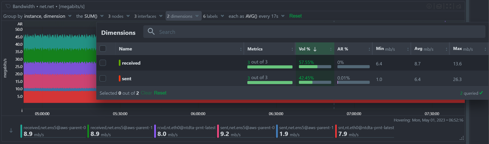 |
| 167 | |
| 168 | | Metric Information | Description | |
| 169 | |---------------------|-----------------------------------------------------| |
| 170 | | Volume contribution | Shows how much each metric contributes to the total | |
| 171 | | Anomaly rate | Displays anomaly rate for the selected timeframe | |
| 172 | | Value statistics | Shows minimum, average, and maximum values | |
| 173 | |
| 174 | ## Group By Dropdown |
| 175 | |
| 176 | The **Group by** dropdown allows you to apply different grouping strategies on the same dataset: |
| 177 | |
| 178 | 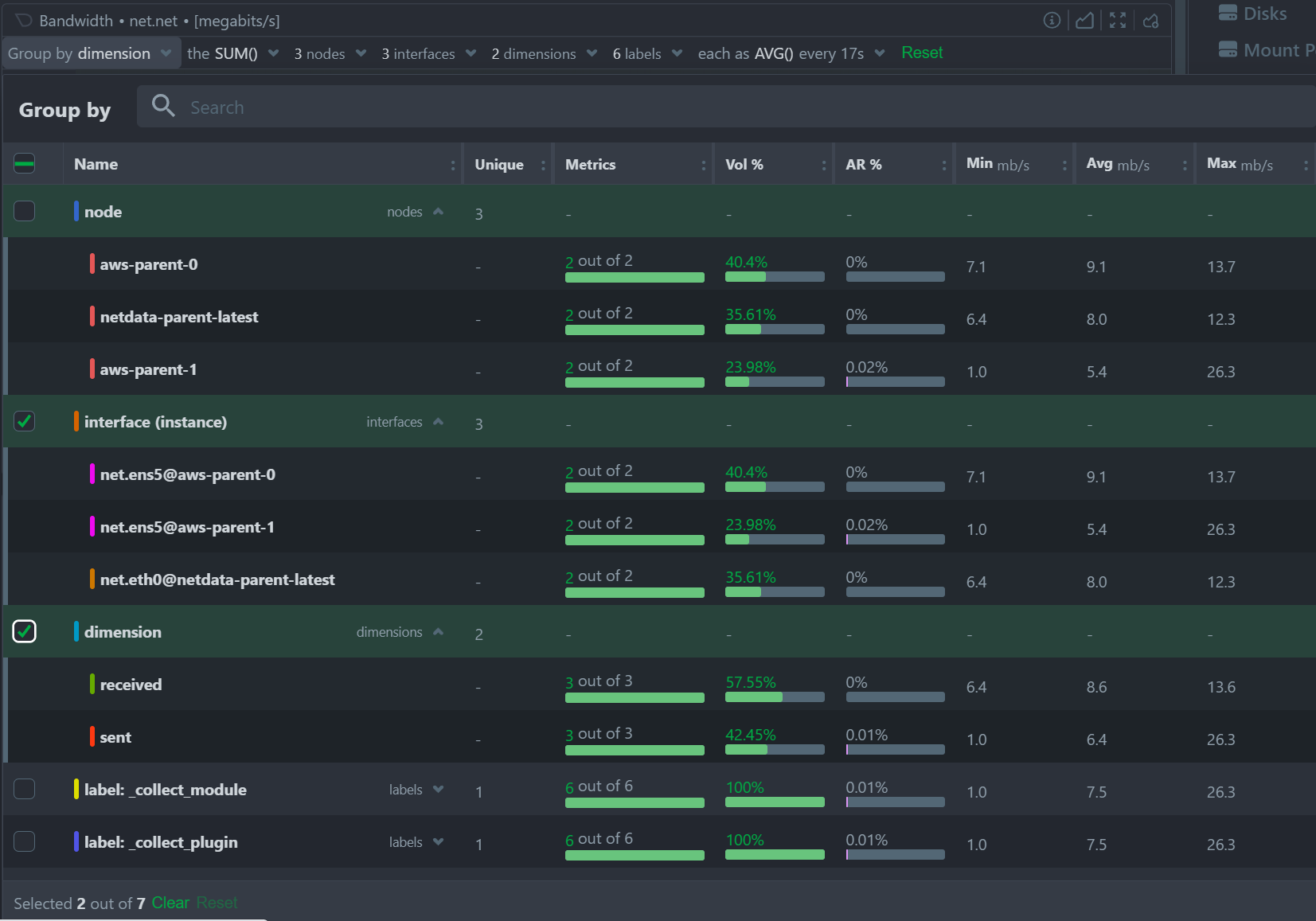 |
| 179 | |
| 180 | | Grouping Option | Description | |
| 181 | |--------------------|------------------------------------------------------------| |
| 182 | | Group by Node | Summarize data by node with one dimension per node | |
| 183 | | Group by Instance | Summarize data by instance with one dimension per instance | |
| 184 | | Group by Dimension | Aggregate data across all nodes by dimension | |
| 185 | | Group by Label | Summarize data based on label values | |
| 186 | |
| 187 | :::tip |
| 188 | |
| 189 | When working with cgroups (VMs and containers), using **Group by Instance** shows data from all contributing cgroups. Apply additional filters to focus on specific instances and save these views to your dashboards. |
| 190 | |
| 191 | ::: |
| 192 | |
| 193 | :::tip |
| 194 | |
| 195 | Use **Group by Instance, Dimension** to visualize the time series for each individual collected metric in the chart. |
| 196 | |
| 197 | ::: |
| 198 | |
| 199 | ## Aggregate Functions Dropdown |
| 200 | |
| 201 | Each chart has a default aggregation function, which you can adjust as needed: |
| 202 | |
| 203 | 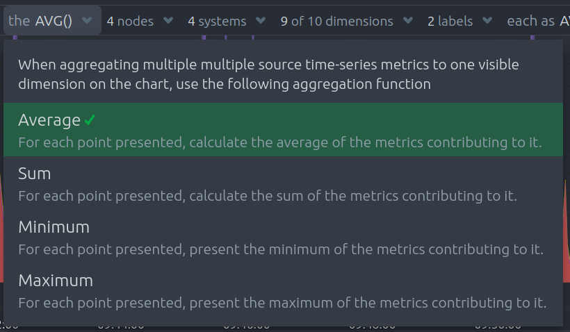 |
| 204 | |
| 205 | | Function | Description | |
| 206 | |----------|-----------------------------------------------------------------------------------------------------| |
| 207 | | Average | Displays the average value across sources | |
| 208 | | Sum | Shows the sum of all contributed values | |
| 209 | | Min | Displays the minimum value (closest to zero or largest magnitude for negative values) | |
| 210 | | Max | Displays the maximum value (largest magnitude for positive values or closest to zero for negatives) | |
| 211 | |
| 212 | ## Aggregate Functions Over Time – Additional Dropdown Examples |
| 213 | |
| 214 | When selecting aggregation functions over time, charts may offer dropdown menus for **Percentiles** and **Trimmed Mean / Median** selection. Below are examples of these dropdowns: |
| 215 | |
| 216 | ### Percentile Selection Example: |
| 217 | |
| 218 |  |
| 219 | |
| 220 | ### Trimmed Mean / Median Selection Example: |
| 221 | |
| 222 |  |
| 223 | |
| 224 | These options let you control how outliers and edge cases are handled during time-based aggregation. |
| 225 | |
| 226 | ## Nodes Dropdown |
| 227 | |
| 228 | Filter and explore the contribution of each node to your chart: |
| 229 | |
| 230 | 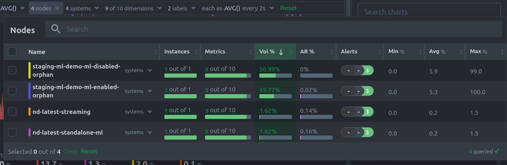 |
| 231 | |
| 232 | | Node Information | Description | |
| 233 | |-------------------------|----------------------------------------------------------| |
| 234 | | Contribution percentage | Shows each node’s share of the total data volume | |
| 235 | | Anomaly rate | Displays anomaly rate per node | |
| 236 | | Error messages | Lists any errors preventing nodes from contributing data | |
| 237 | |
| 238 | ## Instances Dropdown |
| 239 | |
| 240 | Use the **Instances** dropdown to filter or view the contribution of specific instances within your data: |
| 241 | |
| 242 | 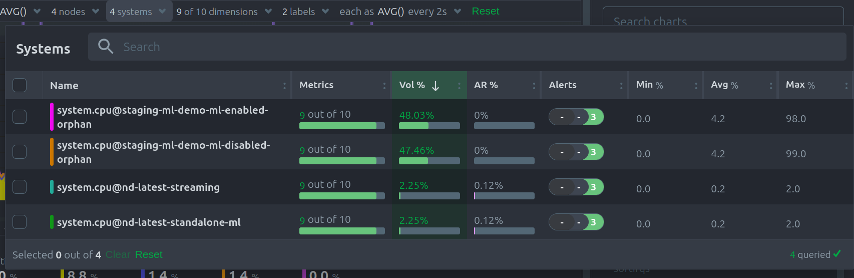 |
| 243 | |
| 244 | | Instance Information | Description | |
| 245 | |-------------------------|--------------------------------------------------------------| |
| 246 | | Contribution percentage | Shows how much each instance contributes to the chart volume | |
| 247 | | Anomaly rate | Displays the anomaly rate for each instance | |
| 248 | |
| 249 | ## Dimensions Dropdown |
| 250 | |
| 251 | The **Dimensions** dropdown allows you to filter by or focus on particular dimensions within your chart: |
| 252 | |
| 253 | 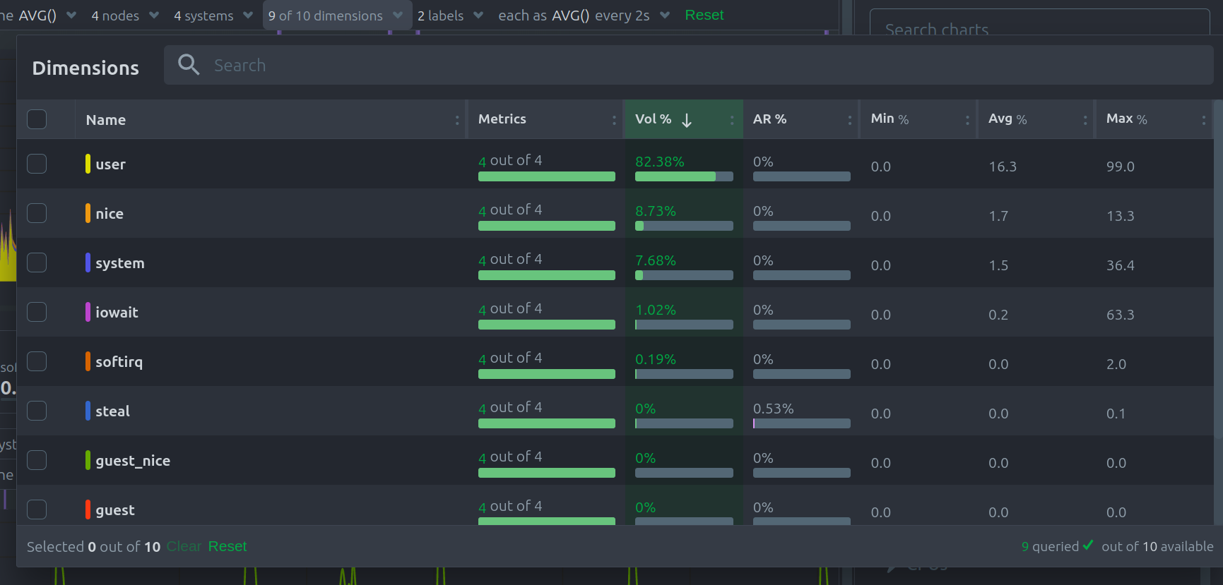 |
| 254 | |
| 255 | | Dimension Information | Description | |
| 256 | |-------------------------|---------------------------------------------------------------| |
| 257 | | Contribution percentage | Shows how much each dimension contributes to the chart volume | |
| 258 | | Anomaly rate | Displays the anomaly rate for each dimension | |
| 259 | |
| 260 | ## Labels Dropdown |
| 261 | |
| 262 | Filter or view your data by **labels**, giving you flexibility to isolate metrics by their tags: |
| 263 | |
| 264 | 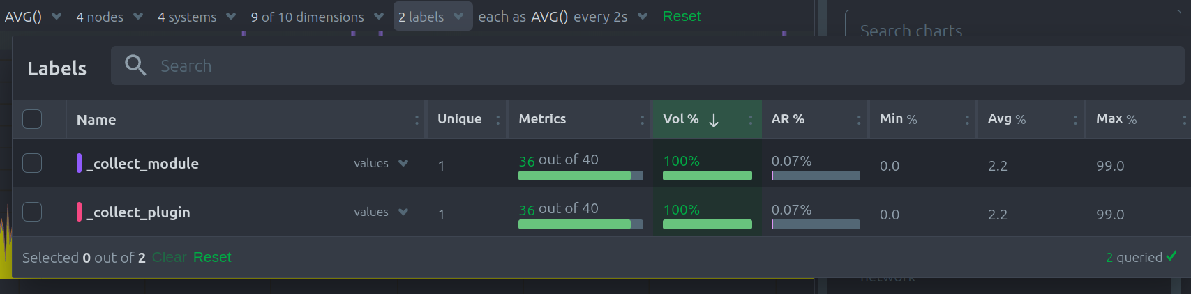 |
| 265 | |
| 266 | | Label Information | Description | |
| 267 | |-------------------------|-------------------------------------------------| |
| 268 | | Contribution percentage | Shows each label’s contribution to chart volume | |
| 269 | | Anomaly rate | Displays the anomaly rate breakdown by label | |
| 270 | |
| 271 | ## Aggregate Functions Over Time |
| 272 | |
| 273 | When data resolution exceeds the chart’s granularity, **time-based aggregation** is applied. The aggregation function over time ensures that large amounts of data are still readable and insightful. |
| 274 | |
| 275 | 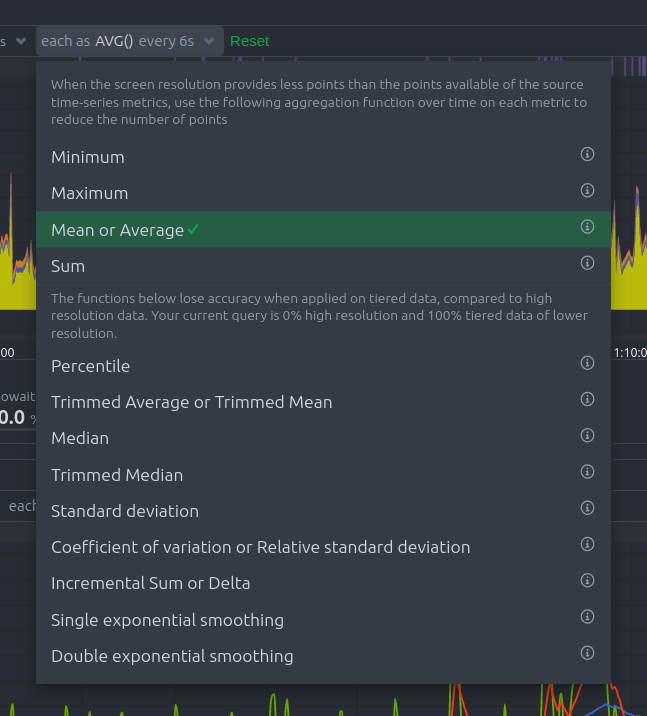 |
| 276 | |
| 277 | | Aggregation Function | Description | |
| 278 | |------------------------------|----------------------------------------------| |
| 279 | | Min, Max, Average, Sum | Basic statistical aggregations | |
| 280 | | Percentile (25th–99th) | Show specific percentiles of the data points | |
| 281 | | Trimmed Mean/Median (1%–25%) | Remove outliers before calculating averages | |
| 282 | | Median | Display the middle value of the data set | |
| 283 | | Standard deviation | Measure data variability | |
| 284 | | Coefficient of variation | Show relative variability | |
| 285 | | Delta | Display the change between data points | |
| 286 | | Exponential smoothing | Apply weighted averaging to recent points | |
| 287 | |
| 288 | :::tip |
| 289 | |
| 290 | For more details, see [Data Queries - Data Grouping](/src/web/api/queries/README.md#data-grouping). |
| 291 | |
| 292 | ::: |
| 293 | |
| 294 | ## Reset to Defaults |
| 295 | |
| 296 | Click the green **Reset** button at the end of the Definition bar to restore the chart’s filtering and grouping options to their defaults. |
| 297 | |
| 298 | ## Anomaly Rate Ribbon |
| 299 | |
| 300 | Netdata uses machine learning models trained on past data to predict expected metric values. These models identify anomalies in real time as soon as outliers occur. |
| 301 | |
| 302 | 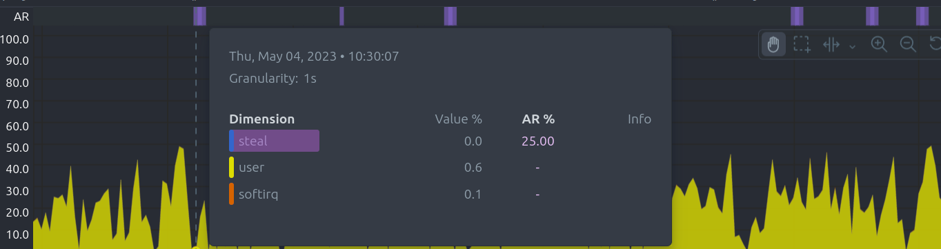 |
| 303 | |
| 304 | | Anomaly Ribbon Feature | Description | |
| 305 | |------------------------|-----------------------------------------------------| |
| 306 | | Visual indicator | Shows the combined anomaly rate across all data | |
| 307 | | Hover information | Displays a histogram of anomaly rates per dimension | |
| 308 | | Real-time detection | Flags anomalies within seconds of occurrence | |
| 309 | |
| 310 | This feature enables you to catch issues quickly across large volumes of metrics. |
| 311 | |
| 312 | ## Hover Over the Chart |
| 313 | |
| 314 | Hovering over any point on a chart reveals a detailed information overlay, making it easy to explore your metrics interactively: |
| 315 | |
| 316 | 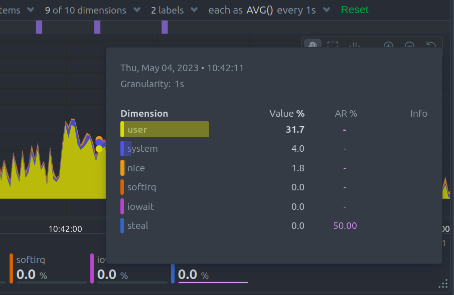 |
| 317 | |
| 318 | | Hover Information | Description | |
| 319 | |-------------------|------------------------------------------------------------------| |
| 320 | | Volume percentage | Shows the contribution of each time series compared to the total | |
| 321 | | Anomaly rate | Displays the anomaly rate for each dimension | |
| 322 | | Collection issues | Indicates any data collection problems | |
| 323 | | Value histogram | Visualizes the distribution of dimension values | |
| 324 | |
| 325 | When you hover over the **Anomaly Rate ribbon**, the dimensions are sorted by anomaly rate, and a histogram displays these rates to help you quickly identify problematic metrics. |
| 326 | |
| 327 | ### Info Column |
| 328 | |
| 329 | The **Info Column** appears during hover and provides detailed data collection insights: |
| 330 | |
| 331 | 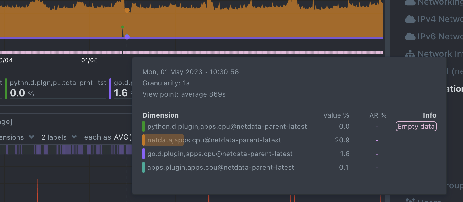 |
| 332 | |
| 333 | | Indicator | Description | |
| 334 | |--------------|-------------------------------------------------------------------------------| |
| 335 | | Partial Data | At least one dimension has partial data (not all instances contributed fully) | |
| 336 | | Overflown | At least one data source has a counter that overflowed | |
| 337 | | Empty Data | At least one dimension has no data for the selected points | |
| 338 | |
| 339 | ## Play, Pause, and Reset Controls |
| 340 | |
| 341 | Control chart playback and interact with time using the **Time Controls**. These controls help you pause or reset the charts while exploring metrics. |
| 342 | |
| 343 | | Interaction | Keyboard / Mouse | Touchpad / Touchscreen | Time Control Effect | |
| 344 | |-------------------------|---------------------------|------------------------|-----------------------------------------| |
| 345 | | Pause chart (temporary) | Hover over the chart | n/a | Temporarily pauses playback | |
| 346 | | Stop chart (lock pause) | Click on the chart | Tap | Locks playback at selected time | |
| 347 | | Reset playback | Double-click on the chart | n/a | Resumes playback (returns to Play mode) | |
| 348 | |
| 349 | These controls work when the **default “Pan” action** is selected in the toolbar. |
| 350 | |
| 351 | ## Toolbar |
| 352 | |
| 353 | The chart **Toolbar** provides interactive tools for manipulating the chart view: |
| 354 | |
| 355 | 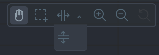 |
| 356 | |
| 357 | | Tool | Description | |
| 358 | |-----------------|-----------------------------------------| |
| 359 | | Pan | Move through the timeline | |
| 360 | | Highlight | Select specific timeframes for analysis | |
| 361 | | Select and Zoom | Zoom into selected timeframes | |
| 362 | | Chart Zoom | Zoom in or out on the chart | |
| 363 | | Reset Zoom | Return to the original view | |
| 364 | |
| 365 | ### Pan |
| 366 | |
| 367 | Use the **Pan Tool** to navigate through time on the chart: |
| 368 | |
| 369 | | Pan Interaction | Keyboard | Mouse | Touchpad/Touchscreen | |
| 370 | |------------------|----------|----------------|----------------------| |
| 371 | | Pan through time | n/a | Click and drag | Touch drag | |
| 372 | |
| 373 | Drag right to move backward in time and left to move forward. |
| 374 | |
| 375 | ### Highlight |
| 376 | |
| 377 | The **Highlight Tool** allows you to select timeframes for deeper analysis: |
| 378 | |
| 379 | | Highlight Interaction | Keyboard/Mouse | Touchpad/Touchscreen | |
| 380 | |-----------------------|------------------------------------------------------|----------------------| |
| 381 | | Highlight timeframe | Alt + mouse selection or ⌘ + mouse selection (macOS) | n/a | |
| 382 | |
| 383 | Use highlighting to investigate spikes, anomalies, or unusual behavior. Click on the chart area to clear the highlight selection. |
| 384 | |
| 385 | ### Select and Zoom |
| 386 | |
| 387 | Zoom into specific timeframes for maximum data granularity: |
| 388 | |
| 389 | | Zoom Interaction | Keyboard/Mouse | Touchpad/Touchscreen | |
| 390 | |------------------------|------------------------------------|----------------------| |
| 391 | | Zoom to timeframe | Shift + mouse vertical selection | n/a | |
| 392 | | Horizontal Y-axis zoom | Shift + mouse horizontal selection | n/a | |
| 393 | |
| 394 | ### Zoom In and Out |
| 395 | |
| 396 | The **Chart Zoom** tool allows you to zoom in and out to view different time ranges: |
| 397 | |
| 398 | | Zoom Interaction | Keyboard/Mouse | Touchpad/Touchscreen | |
| 399 | |------------------|---------------------------|-----------------------------------------------| |
| 400 | | Zoom in/out | Shift + mouse scrollwheel | Two-finger pinch or Shift + two-finger scroll | |
| 401 | |
| 402 | Zooming in helps you analyze recent events in detail, while zooming out provides an overview of longer-term trends. |
| 403 | |
| 404 | ## Dimensions Bar |
| 405 | |
| 406 | The **Dimensions Bar** allows you to manage how dimensions are displayed within the chart. Sorting and hiding dimensions helps you focus on the most relevant data. |
| 407 | |
| 408 | ### Order Dimensions Legend |
| 409 | |
| 410 | You can sort the dimensions legend using various criteria: |
| 411 | |
| 412 | 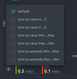 |
| 413 | |
| 414 | | Sorting Option | Description | |
| 415 | |------------------------|---------------------------------------------------------| |
| 416 | | Dimension name | Sort alphabetically (ascending or descending) | |
| 417 | | Dimension value | Sort by current metric values (ascending or descending) | |
| 418 | | Dimension anomaly rate | Sort by anomaly rate (ascending or descending) | |
| 419 | |
| 420 | ### Show and Hide Dimensions |
| 421 | |
| 422 | Simplify your charts by showing only the dimensions you want to focus on: |
| 423 | |
| 424 | | Dimension Interaction | Keyboard/Mouse | Touchpad/Touchscreen | |
| 425 | |------------------------------|------------------------|----------------------| |
| 426 | | Show one dimension only | Click on the dimension | Tap | |
| 427 | | Toggle individual dimensions | Shift + click | n/a | |
| 428 | |
| 429 | This feature is especially useful for identifying unusual behavior by isolating specific metrics. |
| 430 | |
| 431 | ## Resize a Chart |
| 432 | |
| 433 | Adjust the height of a chart to fit your analysis needs: |
| 434 | |
| 435 | - **Resize**: Click and drag the resize handle located at the bottom-right corner of the chart. |
| 436 | - **Restore original size**: Double-click the resize handle. |
| 437 | |
| 438 | This allows you to expand charts for more detailed analysis or condense them for a broader dashboard view. |
| 439 | |
| 440 | *Netdata charts combine clarity, flexibility, and interactivity, designed to help you focus on what matters most in your infrastructure.* |